I would think about dropping the "a" down with "game" for a better balance of words per line. Maybe look into changing the direction that the characters recede in to make it give more variation in where lines are leading the eyes. Looks interesting, I'm excited to see how you overcome any challenges you might face.
Is this going to be continued in the final project? If so, I would like to see more of this style of text and solid fields of color but with different subject matter. It reminds me of an advertising poster.
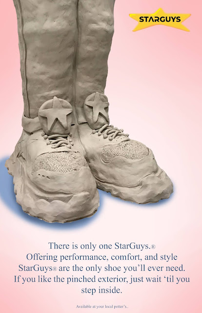
For the final project I'd like to make an ad campaign for these clay shoes I have created. I was inspired by vintage tennis shoe ads in my design. Let me know what you guys think and how I can improve the work.. Thanks!


I would think about dropping the "a" down with "game" for a better balance of words per line. Maybe look into changing the direction that the characters recede in to make it give more variation in where lines are leading the eyes. Looks interesting, I'm excited to see how you overcome any challenges you might face.
ReplyDeleteIs this going to be continued in the final project? If so, I would like to see more of this style of text and solid fields of color but with different subject matter. It reminds me of an advertising poster.
ReplyDelete